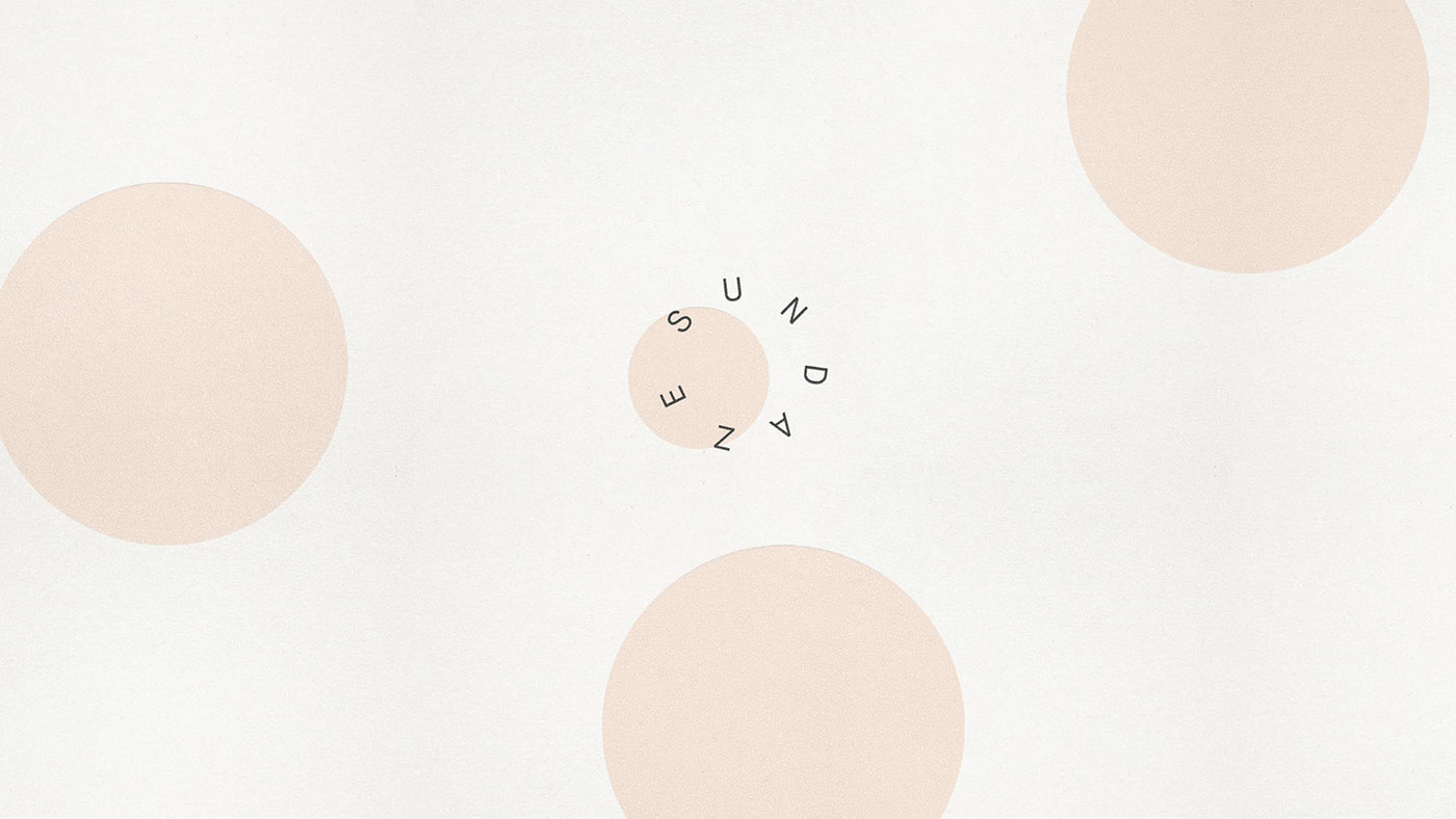
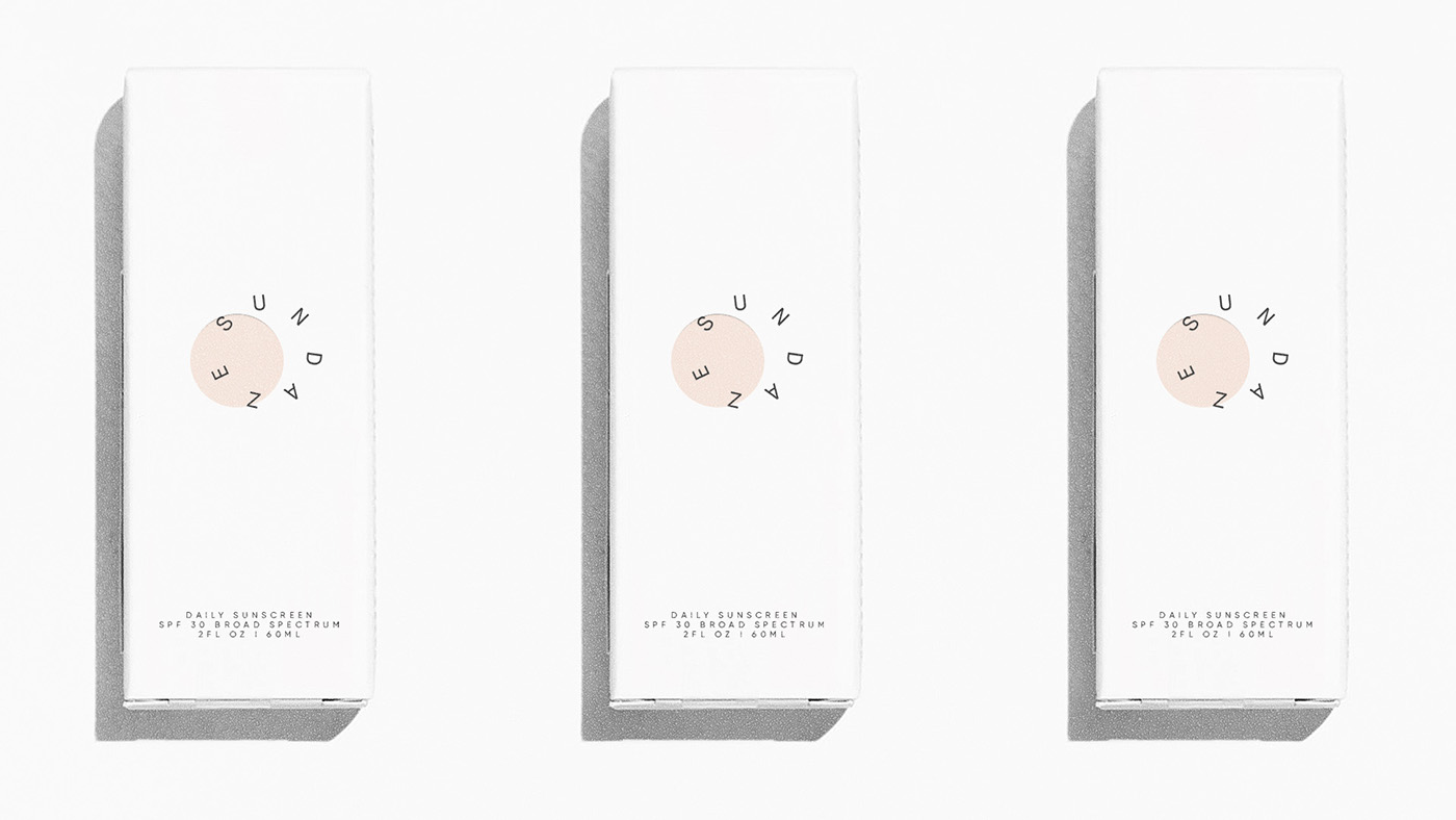
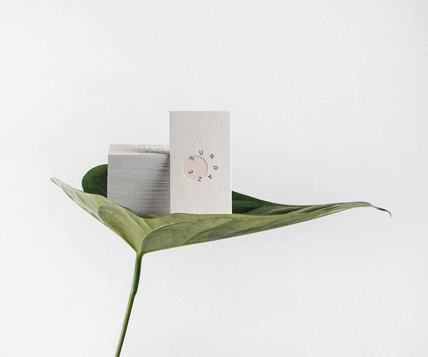
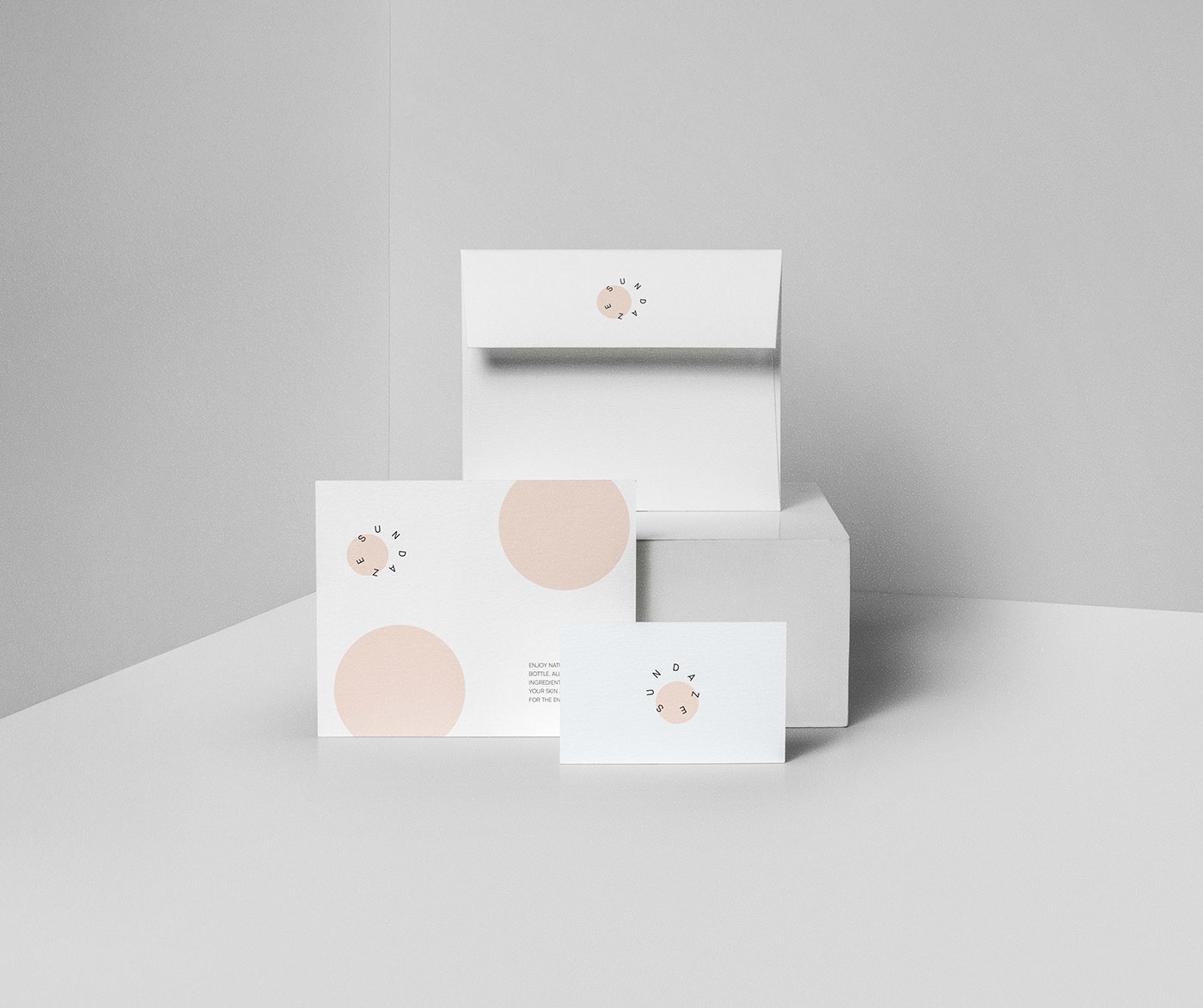
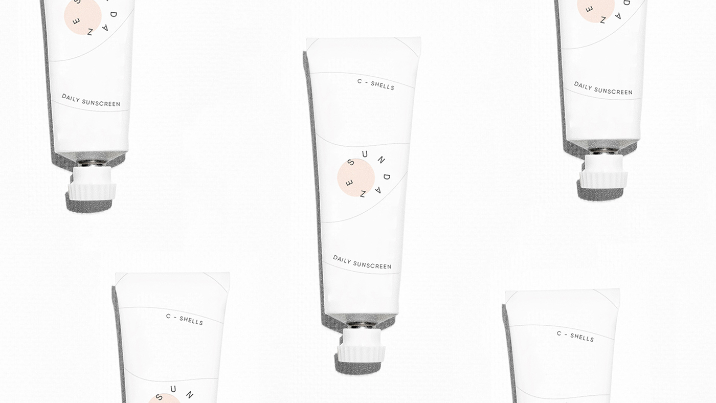
We are going to share some creative ideas by Caterina Bianchini, which designed for San Francisco-based skincare brand Sundaze. This unique concept is designed to explore the use of unique graphic placement. The logotype has been developed to sit like a partial eclipse, giving a subliminal nod towards the products main purpose, as a daily sunscreen. The logo is placed by getting the inspiration from the sun. Which look very elegant and creative. The design is continued across the packaging creating a coherent and bold range that will set itself apart from all other options in the market. Must check it out Catarina’s on behance.
