Whether you are a professional graphic designer or an entrepreneur willing to learn and building a brand yourself, you need to remember that designing a good logo takes patience, time, and commitment. The world is already replete with logos in all shapes and sizes and if yours resembles any of them especially if they are already popular, then it will simply defeat its purpose.
It’s pretty common for logo designers to check out some of the best logo ideas online for inspiration and come up with new ideas of their own. After all, it’s not easy to create fresh designs when you don’t know what some of the best logos look like. However, there is a catch.
The Risks of Following Logo Design Trends
When you are studying popular logos online, then it’s important that you identify the techniques and design elements used in them but in the end use discretion when you create your own designs. This is because many of these ideas have been used so many times already that they appear simply cringe-worthy and cliched.
Professional logo designers know how to avoid trends, however if you are making your own logo with a logo design software program or with an online logo creator program then make sure that you avoid the following trends:
Arc Over the Top
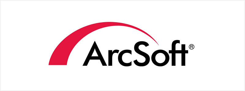
Maybe there was a time when logos like this were considered some of the best and could have a huge impact on the target demographic. However, that time has clearly gone now. There is no place for this over the top arc design in the logos of the current generation, especially in a manner above. Doing this will only reflect that your brand is unimaginative and uninspiring as it doesn’t convey anything new or original.
Thin Lines
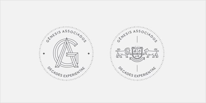
Logos that use thin lines are fundamentally flawed. This is because one of the characteristics of a great logo design is adaptability, and when you create a logo that uses light or thin borders, then you neglect this factor. Think about it- you need a logo that looks good everywhere- from a giant billboard to a small business card. However, if the main design’s borders are thin, then the logo may become illegible on small objects.
Swooshy Human Figures
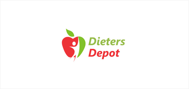
Using human figures in logos sounds like a good idea on paper and has in fact worked for many years. After all, they do make the logos friendly and welcoming. However, they also make for one of the most overused design concepts that now just seem to covey laziness. You can confirm this by checking the logos of some of the oldest businesses in your city. You will find a large number of these logos using generic and swooshy human figures. Seriously, it’s about time that this idea died for good.
Random Colored Dots
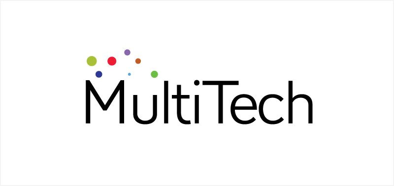
It just doesn’t make sense to put random colored dots on a logo even though it was a trend for a while. Maybe if the colors are chosen carefully and they are no more than 3 and fit the brand’s color palette, then maybe the design could work. However, if the dots look like the logo above, then they will make the design look like a product of a child or an amateur college student at best.
Your Own Face
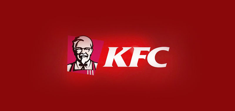
The KFC logo is easily one of the most popular logos that carries the face of the founder i.e. Colonel Harland Sanders. However, it’s also one of the few logos that work part of which could have to do with the fact that Sanders is an iconic man, at least if you read about his real-life story which is both inspiring and saddening.
KFC logo is a result of a special story and it just “clicks”. However, other businesses should avoid creating logos that bear their faces unless they want to come off as self-centered individuals who want to promote themselves more than their products. Besides, there are so many other concepts to work with, so why this one only?
Bottom Line
No one can deny that creating a unique logo is tough. However, you don’t create one every day which is why you should be patient with the process and do your homework before getting started. Even if you are actually creating new logos every day, which could be the case if you are a professional logo designer, then you should at least avoid being cliched and experiment with new concepts and ideas to make your clients happy. Who knows, one of your designs could go viral and open doors to new opportunities?